If you are an entrepreneur who wants to make a website by themselves Another important thing In addition to corporate information Product or service information, including images, colors, and website logos that you will need to keep in mind are the “fonts” or fonts on your website. If you compare fashion magazines with business magazines, clearly different things In addition to images that are conveyed to different target groups to understand It’s the font itself. That clearly differentiates the two magazines. which you too can know the appropriateness of the use of fonts on the website without having to go to school to become a professional designer
Readyplanet has questions for you to test today. If you can answer only these 7 questions, then you will be able to understand. And it’s not difficult to choose the right font for your business.
1. What would you like the website to look like?
website creation It is like building an online storefront for your business. No matter how you want people who click on your website to feel about your business. You can use the fonts that appear on the pictures. or a description that the website page can guide them. For example, your business is a beauty business. You might use a font that is elegant, rounded, and most feminine. Or, if your business sells tech products like mobile phones, tablets, cameras, etc., you might opt for a font that feels like the future. which all depends on you Where do you want to place the brand’s position? If you can answer this question. You’re one step closer to making a good website.
2. Who would you like to communicate with?
We want you to imagine that Who is your customer group? What does it look like? What is your preference like? And what kind of website will they be interested in?
For example, your client is a 25-40-year-old male with a sensational personality. like to travel and love photography When you know this It will be much easier for you to choose a font that suits them. Because you can cut beautiful, rounded fonts. Or a childish handwritten font, get out of the idea.
3. What type of website is your website?
If your website is an online store that use the message to motivate customers to close the sale The appropriate font that you choose to use. It should be a bold, clear, and inspirational typeface. You should not use scrabble fonts. Or a font that looks like handwriting on the “Buy Now” button because the brain of online consumers instead of letters to words. instead of fonts to sound Using italics, scrabble, or gimmicks will make customers feel insecure and feel that you are not serious about selling
But if your website is an educational blog or a website for corporate promotion You can choose to use fonts that are more playful. to increase intimacy with the reader Be like you’re speaking to them in a friendly way. But if your website is a website in a government organization or websites that provide academic knowledge Official fonts may also be necessary. for corporate credibility.
4. Is it better to use Serif or Sans Serif fonts?
The differences in the use of Serif and Sans serif fonts are well known in the designer world. But if you are an entrepreneur without knowledge of the arts Or too many designs, today we will explain the difference between the two fonts to understand each other.
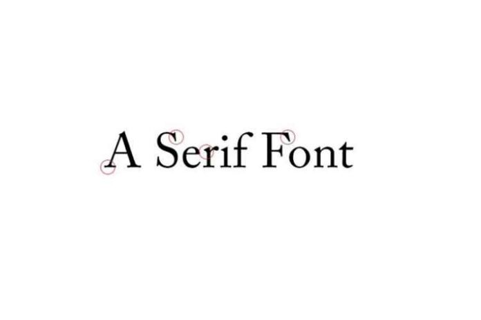
Serif is a font with a small dash at the end. As it appears in the Times family of fonts, this type, also known as roman, originated from the Roman script inscribed in stone. Serifs help to sweep across the characters. make it easy to read and is commonly used for printing text. The Sans Serif (Sans Serif) has the opposite characteristics. is that there is no dash at the end of the letter and is also called the Gothic (gothic), this type of font is not suitable for the body But it’s great for using a headline or headline that needs attention. through a single glance. Should understand its use first.
5. Will customers be able to read these fonts?
For beauty, Of course, you can use fonts that are playful to grab attention. but in the end, The main content area of the website Use fonts that are easy to read, not scrambled, small, or the letters are too close together. Because even if the content of your web page is interesting how much. But if the font is too hard to read It makes it easy for the reader to lose interest as well.
6. Is your website using too much bold text?
Bold, voluminous, and bold test fonts may be appropriate for headlines. Or write a short message that will catch the reader’s attention. But it may not be completely compatible with printing it as a text for discussion or education. Because those fonts are designed to make the reader feel solemn and clear. Using that type of font in every message will make your customers feel like you’re constantly slamming into their faces. Of course, that’s not the goal you want to communicate. Take a good look at your website. If you find any point that uses too many bold fonts Try modifying the font in a slimmer way. Then your website will be able to read more comfortably.
7. Are your fonts compatible with all platforms?
When you check that Your fonts are now beautiful on your desktop. The next important thing you need to do is Verify that the font you choose When displayed on smartphones and tablets, can be displayed well or not?


